Okay, there's at least two big ones:
1) 1943 Steel , not 1944 Zinc US Pennies
2) "Travail, Patrie, Famille" was the Vichyiste trifecta that appeared on coins; NO "état"!
and:
3) Was there really a shortage of silver in 1964-65? I thought it was inflation that caused the abandonment of silver in circulating coins.
Citeer: "CassTaylor"This seems fun!
Okay, there's at least two big ones:
1) 1943 Steel , not 1944 Zinc US Pennies
2) "Travail, Patrie, Famille" was the Vichyiste trifecta that appeared on coins; NO "état"!
and:
3) Was there really a shortage of silver in 1964-65? I thought it was inflation that caused the abandonment of silver in circulating coins.
No shortage, just the slow steady rise in the price of silver. Silver certificates will still redeemable until 1968.
Citeer: "Camerinvs"Well done!
Footnote 8 says:
«For the extremity of the shortage, little remembered today, see Rickenbacker, Wooden Nickels, 13-22.»
Which is a 1966 book:
William F. Rickenbacker, Wooden Nickels: Or the Decline and Fall of Silver Coins
https://www.amazon.com/Wooden-Nickels-Decline-Silver-Coins/dp/B003VZX8O6
Why change the way to add links behind text when it was plain and easy before, and now doesn't work?
hopefully it is a temporary java outage, like the photo posting issue was, a few days ago.
google books has the Rickenbacker book, but my browser wont open the citations
Jamais l'or n'a perdu la plus petite occasion de se montrer stupide. -Balzac
Citeer: "Camerinvs"Well done!
Footnote 8 says:
«For the extremity of the shortage, little remembered today, see Rickenbacker, Wooden Nickels, 13-22.»
Which is a 1966 book:
William F. Rickenbacker, Wooden Nickels: Or the Decline and Fall of Silver Coins
https://www.amazon.com/Wooden-Nickels-Decline-Silver-Coins/dp/B003VZX8O6
Why change the way to add links behind text when it was plain and easy before, and now doesn't work?
hopefully it is a temporary java outage, like the photo posting issue was, a few days ago.
google books has the Rickenbacker book, but my browser wont open the citations
I just tried it, it seems to be perfectly fine now:
The US didn't abandon silver entirely in the coins in 1965 either, the half dollars had the silver reduced, but they still had a 40% silver content until 1970.
Here is Haxby describing Canadian silver concerns in light of the American situation. It looks like indeed there was a rather sudden shortage:
He goes on to say that the authorities were concerned with giving enough time to owners of coin-operated machines to update them.
This is a great book which I have used before on Numista. I've seen it in used bookstores quite a few times, and always under $15. So, Canadian collectors, make sure you check the collectibles section if you're in a bookstore somewhere.
BTW this is the same Haxby who has a website all about the Canadian 1859 large cent https://www.vickycents.com/.
EDIT 1 ─ Oh! To reply to Sophie, the author is David Schaps, Handbook for Classical Research, Routledge 2011.
EDIT 2 ─ I still can't add links to text.
EDIT 3 ─ I've always been puzzled why the US wasted silver in the ½ dollar like this. Perhaps pure nickel or nickel clad would have been too hard to strike? Canada reduced the size of the 50¢ and 1$ because of the hardness of nickel.
Well, at least you can use that fancy coloured text. How do you do that?
I always thought the half dollar remaining in 40% silver for 4 more years was because the half was the most unpopular denomination in the US, so they just decided it didn't matter. That's certainly the case now, as my American friends have testified; but when did it start becoming the case? (1960s?)
50¢ were used for a long time in slot machines at casinos:
Because of low demand, no halves were struck for general circulation in 1987. In addition, casinos, where halves were still commonly used, increasingly replaced them with 50¢ chips. Beginning in 2002, the half dollar ceased to be struck for general circulation. The coin is found in mint sets and can be purchased from the Mint in rolls and bags, at a premium above face value.
I got this ↑↑↑ added to the Kennedy halves page (https://en.numista.com/catalogue/pieces6918.html) some time ago, but then someone had some of it removed, including the reference to the source. (I'm not going to waste my time any longer with providing useful information if simpletons get it removed later.)
As for fancy colors, if you reply by clicking on "quote", and then clicking on "source", you'll know how to do it.
Citeer: "CassTaylor"This seems fun!
Okay, there's at least two big ones:
1) 1943 Steel , not 1944 Zinc US Pennies
2) "Travail, Patrie, Famille" was the Vichyiste trifecta that appeared on coins; NO "état"!
and:
3) Was there really a shortage of silver in 1964-65? I thought it was inflation that caused the abandonment of silver in circulating coins.
Technically, it was "Travail - Famille - Patrie" in that order. And even more technically, I would not call "Republique Française" nor "État Français" slogans, but the names of the country/state itself.
Citeer: "Camerinvs"I got this ↑↑↑ added to the Kennedy halves page (https://en.numista.com/catalogue/pieces6918.html) some time ago, but then someone had some of it removed, including the reference to the source. (I'm not going to waste my time any longer with providing useful information if simpletons get it removed later.)
It's a shame, that's the kind of info each coin page needs, but simpletons removing the good work of others has always been a problem here. ...
or is it its?
Taking a break from swapping for a while, but still interested in pre 1799 Spanish coins, I will make time for that!
Citeer: "Camerinvs"I got this ↑↑↑ added to the Kennedy halves page (https://en.numista.com/catalogue/pieces6918.html) some time ago, but then someone had some of it removed, including the reference to the source. (I'm not going to waste my time any longer with providing useful information if simpletons get it removed later.)
It's a shame, that's the kind of info each coin page needs, but simpletons removing the good work of others has always been a problem here. ...
or is it its?
@Camerivnvs
Gotcha! This looks magnificent! How many colours can we do (do you know?)
@redsmithstudios
Hey, nice to have you back! Long time no see.
@Jesse11
You are quite correct; at least my mistake wasn't as egregious as the author's!
How many colours? I have tried the standard names: blue / red / green / purple / yellow (not recommended!) / orange / brown / grey. I suppose white would work as well ─this is a test─ but it's not particularly effective on a white background...
I suppose hue codes would work as well, which would mean thousands of nuances. Test:
TESTTESTTEST TESTTESTTESTTEST
EDIT: As you can see, I used random hue codes (# + 4 digits) and it works, but always grey shades it seems.
OK, another test with #FF:
TEST
EDIT:
So, let me try the above ones with FF:
▓▓▓ ▓▓▓▓
and now it's all shades of red...
The ones below are aquamarine #76EEC6, dark orchid #68228B, and deep pink 3 #CD1076:
▓▓▓
@smithstudios
It's "it's" in that case, of course. Most often, people use "it's" where they should use "its". It's rare the "mirror" mistake (its for it's) happens.
Citeer: "Camerinvs"@Cass:
How many colours? I have tried the standard names: blue / red / green / purple / yellow (not recommended!) / orange / brown / grey. I suppose white would work as well ─this is a test─ but it's not particularly effective on a white background...
I suppose hue codes would work as well, which would mean thousands of nuances. Test:
TESTTESTTEST TESTTESTTESTTEST
EDIT: As you can see, I used random hue codes (# + 4 digits) and it works, but always grey shades it seems.
OK, another test with #FF:
TEST
EDIT:
So, let me try the above ones with FF:
▓▓▓ ▓▓▓▓
and now it's all shades of red...
The ones below are aquamarine #76EEC6, dark orchid #68228B, and deep pink 3 #CD1076:
▓▓▓
@smithstudios
It's "it's" in that case, of course. Most often, people use "it's" where they should use "its". It's rare the "mirror" mistake (its for it's) happens.
the RBG code is three hex pairs #RRGGBB, directing the intensity of the three colors Red,Green and Blue, that make up each pixel. there are hex digits 1-9,A,B,C,D,E,F, a two digit hex figure has 16X16=256 grades.
256 shades of each color =1677216 possible colors.
Jamais l'or n'a perdu la plus petite occasion de se montrer stupide. -Balzac
Citeer: "Mr. Midnight"The RBG code is three hex pairs #RRGGBB, directing the intensity of the three colors Red,Green and Blue, that make up each pixel. there are sixteen levels of each color 1-9,A,B,C,D,E,F
16x16x16=4096 possible colors.
I suppose that's why the letters are always A to F?
Citeer: "Mr. Midnight"
The RBG code is three hex pairs #RRGGBB, directing the intensity of the three colors Red,Green and Blue, that make up each pixel. there are sixteen levels of each color 1-9,A,B,C,D,E,F
16x16x16=4096 possible colors.
I suppose that's why the letters are always A to F?
yes that's how to count to 16. I had to re-write the above - its hex pairs 16x16, per color.
FF hex = 256 dec. it also equals 11111111 in binary. its an 8 bit byte value.
that goes back to early days of computing. ( and my 1970s high school education)
Jamais l'or n'a perdu la plus petite occasion de se montrer stupide. -Balzac
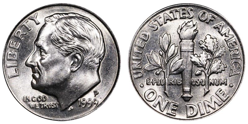
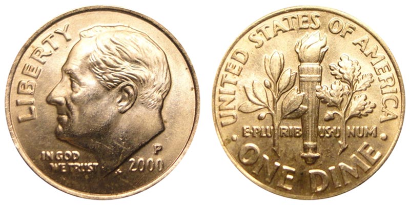
Now in the book, are they talking about Canada or the US. The Canadian dimes are nickel and nickel plated steel. The US you have old design 1972. And new design 2002. To me they are two very different coins.
US old design US new design
The biggest difference is in the word Liberty
The old design the letter are bigger.
One of the first things I checked is whether the Roosevelt dime was the same between 1972 and 2002 in the Numista catalogue, and it is considered one single type since 1965. The difference in the letter size, which I hadn't noticed, is a minor variety that could indeed be pointed out on the page (https://en.numista.com/catalogue/pieces53.html which I still can't link in the text). When did they adjust the size of the letters?
We had adjustments with the Canadian beaver nickel (fur better defined) and "Looney" dollar (water lines better defined so that they won't disappear with wear).
As for colour, no, they won't be used excessively I think. I use them myself once in a while, e.g. when I edit one of my posts or replies.
And Mr. Midnight you know a lot lot more than I do about hue! I was actually just experimenting with numbers, not knowing whether the codes would work in Numista.
in two separate tabs, and click back and forth, you'll see the difference between 1999 and 2000. Indeed the effigy is smaller and is better proportioned to the size of the coin.


